


Select a topic on the left to learn more.
Please send an email to with any unanswered questions!
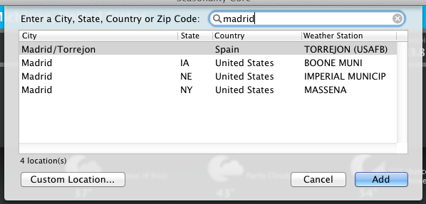
To add a new location, simply hit the + button in the bottom left corner of the window. A panel will be displayed where you can enter a search string to find locations. The search string can either be a city, state, country, zip code, or airport ICAO identifier. As you type characters into the search field, Seasonality Core will search and display the locations that match the text you've entered. After selecting the desired location and clicking Add, Seasonality Core will show it in the location sidebar and start loading its weather data.
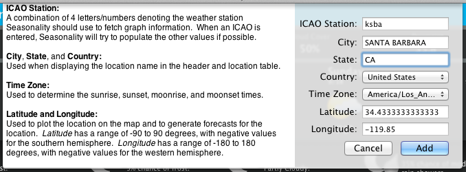
Currently Seasonality Core supports over 34,000 default locations around the globe. However, even with this many locations, you may not find a good location nearby. To resolve this, Seasonality Core allows users to add their own custom locations. To add a custom location, first open the add location panel. Then click on the "Custom Location..." button at the bottom to open the custom location panel. Here you will find text fields for a weather station ICAO, city, state, country, time zone, latitude and longitude. Once an ICAO station is entered, Seasonality Core will attempt to look up that ICAO and fill out the rest of the location information with the weather station's data. Either accept the default values, or alter them to customize your location. Click the "Add" button when you are done.
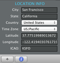
You may wish to customize a location that has already been added. This process can be accomplished by clicking on the Info button (marked with an i) at the bottom-left corner of the Seasonality Core window. This will show a location info panel directly below the location table with some further information about the selected location. Simply change any of those values to modify the selected location. Clicking the info button again will hide the location info panel.
With so many default locations supported, there is a possibility that information for a particular location like the time zone or location on the map may be incorrect. If you discover an error with a location you are using, please send an email to .
Seasonality shows a wealth of current conditions for each of your locations. All of the fields are appropriately labeled and all have tool tips to show more information about the data displayed. Moving from left to right, we have:
Temperature and a feels like temperature are shown first. The actual air temperature is shown by default first. If it is warm enough to have a heat index, or cold enough to have a wind chill, those temperatures will be shown next to the actual air temperature, in parentheses. Heat index factors in temperature and humidity (more humidity makes it "feel" warmer), while wind chill factors in both the temperature and wind speed (a stronger wind will evaporate moisture from your skin faster and make you "feel" cooler).
Wind speed and direction are shown next. The wind speed units are defined in the Seasonality Core preferences, they are not shown here for space reasons. A direction arrow will designate which direction the wind is traveling (or a dot for calm or variable winds). The dominant wind speed is shown next, and if there is a significant gust speed, that will be shown third. For instance, above you see that there is a NE wind at 3 mph. If there was a 7 mph gust, you would see the same arrow and "3-7" for the range of wind speeds.
Pressure in your selected units. The pressure is not station pressure, but instead is the equivalent of the station pressure reduced to mean sea level. This makes comparing pressures between locations at different elevations much more convenient. The average pressure is 1013 hPa, 101.3 kPa, or 29.92 mm Hg.
Cloud cover from 0-100%. Cloud coverage reported by weather stations is restricted to 25% increments, so you will only see Clear - 25% - 50% - 75% - 100% (Overcast).
Dewpoint is the temperature to which the air must be cooled in order for dew to form. The warmer the dewpoint, the more humid the air. Once the dewpoint is the same as the air temperature, humidity will be 100%.
Humidity is the relative humidity calculated by using the dewpoint and the temperature. The range is 0-100%.
Finally, the visibility is a measure of how far you can see if the view was otherwise unobstructed by a non-weather object. A visibility of 10 miles or 16 kilometers is the maximum measured, and indicates that the air is clear. Visibility can quickly drop to below a mile/kilometer in a heavy snowstorm.

Seasonality Core displays the 7 day weather forecast at the top of the window. Forecast information is as accurate as possible. For locations in the United States (excluding Alaska), forecast data comes directly from the National Weather Service's National Digital Forecast Database (NDFD). The forecast for locations outside the United States comes from 0.5 degree GFS model output and is interpreted on the Gaucho Software forecast server. High and low temperatures are displayed along with icons representing the conditions for those time periods and a short text description of what the weather will be like. Seasonality Core will show as many forecast days as can fit in the window. If the window isn't large enough to show a full 7 day forecast, simply click and drag on the forecast to scroll into the future.
By hovering your mouse over a specific forecast period, a tooltip will show up with a more detailed forecast text string.

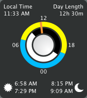
The astronomical view shows a graphical representation with rings of the sun and moon in the center, and specific times around the edges.
The rings show a graphical view of the times where the sun and moon are visible. The times of day are labeled around the outside: 00, 06, 12, and 18. So midnight is at the bottom of the ring, 6am on the left, noon at the top, and 6pm on the right. The outer ring shows the sun times: yellow for when the sun is up, and blue for when the sun is down. The inner ring shows the moon times: white for when the moon is up and black for when the moon is down. There is an orange marker on the rings, showing the time "now". The marker gives you a visual idea of how much of the day or night has passed.
In the center of the graphical representation is the current moon phase, a full moon in this screen capture.
Finally, surrounding the graphical sun and moon display, Seasonality Core displays the exact times of sunrise/sunset (lower left), moonrise/moonset (lower right), current local time for the selected location (upper left), and the hours/minutes of daylight for the selected location (upper right).
Seasonality Core displays weather graphs in the lower left part of the window. Weather observations are collected whenever Seasonality Core is open and are saved into a local database. Observations for most locations are available for the past 96 hours, so you only need to open the application once every 4 days to have a full collection of data. The weather graph displays any data you have previously collected, and the horizontal graph scale can be changed to display from 1 day to 1 year of data. If you wish to view data prior to what is shown on the graph, just grab the graph with the mouse, and slide it over to the right to show past conditions. A vertical dashed line marks when "now" is on the graph.
In addition to past weather observations, Seasonality Core graphs the next 7 day forecast as well. Using the graphs to look at the next 7 days will give you a better idea of what the weather is expected to be like during a particular time of day.
There are 10 different graph modes. I will talk about each of these in the sections below. If you hover your mouse over any of the graphs, a hover "bubble" will display with the exact measurement and time. This makes it very easy to dive into the data and look at specifics.
TemperatureHigh and low temperatures for the time frame shown on the graph are displayed on the temperature graph along with the time when they occurred. The temperature graph will also optionally show the dewpoint temperature as a black line. The dewpoint temperature is the temperature at which the air must be cooled to in order for dew to form. As the dewpoint temperature gets closer to the air temperature, humidity goes up. When the dewpoint is equal to the air temperature, humidity is 100%.
Wind SpeedThe wind speed graph shows gust speed in a lighter blue to give a general feel for the range of wind speeds at the location during a particular time. Also displayed in the wind speed graph is the peak wind speed. If you choose a single wind graph to show, this is the one you want. It's the only graph that gives you the full wind speed and direction (using the hover).
Wind Direction and Cylindrical Wind DirectionThe wind direction graph shows a basic view of which direction the wind is coming from, whereas the cylindrical wind direction graph shows a more complex view of the same data. Both wind graphs center around a yellow line that represents the average wind direction for the time period shown on the graph. The cylindrical view marks the primary directions on the front side of the cylinder. You can use the mouse to spin the cylinder by clicking and dragging it up or down. The average wind direction is shown at the bottom of both graphs.
PressureThe pressure graph shows the weather station pressure reduced to sea level. This graph will also note the ridge pressure (the greatest pressure value during that time period) and trough pressure (the lowest pressure value during that time period). The pressure graph is centered at 1013 hectopascals (29.92 in. Hg), which is the average surface pressure globally (when reduced to sea level). The pressure graph is only available for past observations. Pressure forecasts are not available at this time.
Probability of PrecipitationThis graph is only applicable for times in the future. Seasonality Core will plot the percent chance of rain or snow over the next 7 days. It will also mark the maximum and minimum probabilities along the bottom of the graph.
Precipitation and Snowfall AmountsThese graphs show a precipitation and snow forecast for every location. Some locations will also show past precipitation (not snow) observations, if the weather station supports it. These graphs are the only bar charts of the group. They show the amount of precipitation that is expected (or has fallen) during a certain amount of time. If you add all the bars up, then you will get the total precipitation for that time period (which is shown at the bottom). Some weather stations report observations more often than others, so the bars can vary in width depending on the location's weather station.
In the winter, if snow is expected you will see values on both the precipitation and the snow graph. The snow graph shows how much snow is expected to fall. The precipitation value in this case is how much water content would be in that snow (if the snow that fell was melted). You can get a better idea of how heavy the snow will be if you compare the two numbers. Average snow:liquid ratios range from 10-15 inches of snow for every inch of liquid equivalent. A heavy snow might have a snow:liquid ratio of 4:1, while a dry fluffy snow might have a ratio of 30:1 (expect a lot of snow in these situations, even though it will be less dense).
Cloud CoverThe cloud cover graph displays the amount of sky that is expected to be obscured by clouds at any given time. The cloud cover forecast is much more precise than past observations, but they both give you a pretty good idea of what the sky is like at the time.
HumidityThe humidity graph shows relative humidity on a scale from 0-100%, along with a textual display of the maximum and minimum values on the graph. Relative humidity is not necessarily a good representation of the amount of moisture in the air. The value is defined as the amount of water vapor in the air divided by the maximum amount of water vapor the air can "hold." Since the maximum amount of water vapor air can hold changes with the air's temperature, the relative humidity doesn't really truly tell you how much moisture is in the air. This is why you will often see the relative humidity drop during the day as the temperature rises, and return to a higher level as the temperature cools down at night. Dewpoint, on the other hand, is a very good measure of the moisture in the air, so it's use is encouraged in the temperature graph. Though relative humidity doesn't truly tell you how much moisture is in the air, it does give you a good idea of how comfortable the air will feel, which is why this graph is included in Seasonality Core.
Wave HeightThis graph is for coastal locations in the U.S. only. If you have a location that is over a large body of water (ocean or Great Lakes), this graph will show the forecast for significant wave height. You can think of these heights as how big the "set" waves will be, and not the average wave height. To get a location that is over the water, first add the closest city you would like to view. Then select that city and show the Location Info using the "i" button in the lower-left corner of the Seasonality Core window. Adjust the latitude (north/south) and longitude (east/west) coordinates until the location falls over the body of water. Then reload the data and this graph should populate. Note that the forecasts for these locations over water will change quite a bit. Forecasted temperatures will be much closer to the water temperature, and forecasted wind speeds will be higher because there isn't much friction at the surface of the water.
 Settings
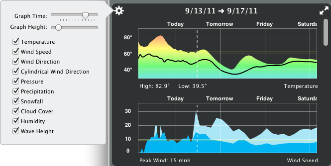
In the Seasonality Core Preferences, there is an option to "Mark Average in Graphs". This will display in a thin yellow line denoting the average value in each graph. So, for example, the yellow line in the temperature graph would be placed at the average temperature value for that time period. Likewise for the wind speed, and other graphs. As mentioned earlier, the wind direction graphs are centered around the average wind direction.
If you click on the gear button in the graphs view, you will see a popup that allows you to select which graphs are shown, define how tall each of the graphs will be shown, and determine how much time is shown on each graph. Changing any of these settings will take effect immediately, so you can see the results of your settings adjustment without delay.
Finally, if all you want to see is the graphs, you can click on the full-size button in the top-right corner of the view. This will animate the graphs to take up the full area of the Seasonality Core window. You can then examine the graphs more effectively before clicking the arrows again to return the graphs to their original state.
Seasonality Core includes high performance mapping code to actively generate custom radar and satellite images to display on your Mac. The map terrain is very high resolution (over 2 gigapixels for the entire globe), and the terrain will change each month throughout the year. This means you will be able to watch foliage change with the seasons, and even see the snow line change in the winter. Maps are stored on Gaucho Software servers and cached on your local Mac, so you will only download and store the maps you actually view.
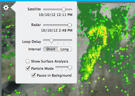
Of course, a map without any weather features to display isn't much use. Seasonality Core offers multiple overlays that you can show on the top of the map. These overlays include radar imagery, infrared satellite imagery, surface analysis, and Particle Mode. In the map settings view, you can configure the opacity of the radar and satellite overlays. You can also see when the last time the radar/satellite image was updated.
The radar is base reflectivity scan data from NEXRAD stations across the United States. Seasonality Core also composites radar from Environment Canada and the Bureau of Meteorology in Australia for coverage in those countries as well. It's impossible to offer radar coverage everywhere, but we continue to look for publicly available radar data offered by other countries. Radar images are updated every 12 minutes.
The satellite images are sourced from the University of Dundee and composited on a Gaucho Software server. Since infrared satellite images are used, you can see where the clouds reside, even at night. The disadvantage of using infrared images is that sometimes low altitude clouds (such as fog) doesn't show up as well in the image. Satellite images are updated every 3 hours.
The surface analysis overlay covers most of North America and annotates weather features that are typically seen on TV weather reports. This includes features like cold fronts, warm fronts, occluded fronts, stationary fronts, low pressure centers, and high pressure centers. The surface analysis is updated every 3 hours.
Particle Mode is an overlay you won't find in any other app. Particle Mode shows what it would look like if you dropped thousands of particles on the surface of the earth and the wind blew them around. This overlay is best viewed while zoomed a bit further out than usual. Seasonality Core downloads the latest model wind data, so what you are seeing matches what is really happening around the world right now. Particles are colored by temperature, so in a quick glance you can see how the temperature changes in different regions. In the map settings, there is a slider where you can set how many particles are simulated (this ranges from around 10,000 to more than 200,000 particles). Choose fewer particles if you don't want to tax the processor of your Mac too much, or more if you want to see the best display possible. There is quite a bit of processing required to run this simulation (Seasonality Core needs to figure out the new position of every particle, 30 times a second). To keep Seasonality Core from using too much of your Mac's processor time, there is a checkbox in the Map settings to disable Particle Mode while the app is in the background.
Navigating around the map is fairly straight-forward. Click and drag on the map to pan to a different area. Click on the + and - buttons to zoom in/out. You can also double-click the map to zoom in or control-double-click the map to zoom out. Finally, if you have a multi-touch trackpad, you can use pinch gestures to control the zoom of the map.
Animating the map display is as easy as clicking the play button in lower-left corner. By dragging the Loop Delay panel, you can speed up or slow down the animation. You can also decide whether you want to show a short interval animation or a long interval animation. The short interval animation will show the last 2 hours of radar images. Since satellite images only change once every 3 hours, the cloud map will remain static while the radar animates through 10 frames. If you would like to see the clouds animate, select the long interval. The long interval will animate the map over the course of 30 hours. This gives you a nice view of how the weather has changed over the past day or so.
Just as you can expand the graphs display, you can also click the full size button in the upper right to expand the map view to the full size of the Seasonality Core window. This is a great way to watch the progression of storms.

